a crossfit center built upon the values of strength, endurance, and community
Objective
The word "Angkor" originates from the Sanskrit "nagara" (नगर), meaning "city". The client aimed to convey a sense of community behind the brand name, while the symbol itself needed to evoke strength, akin to an anchor, due to its similar pronunciation.
The Outcome
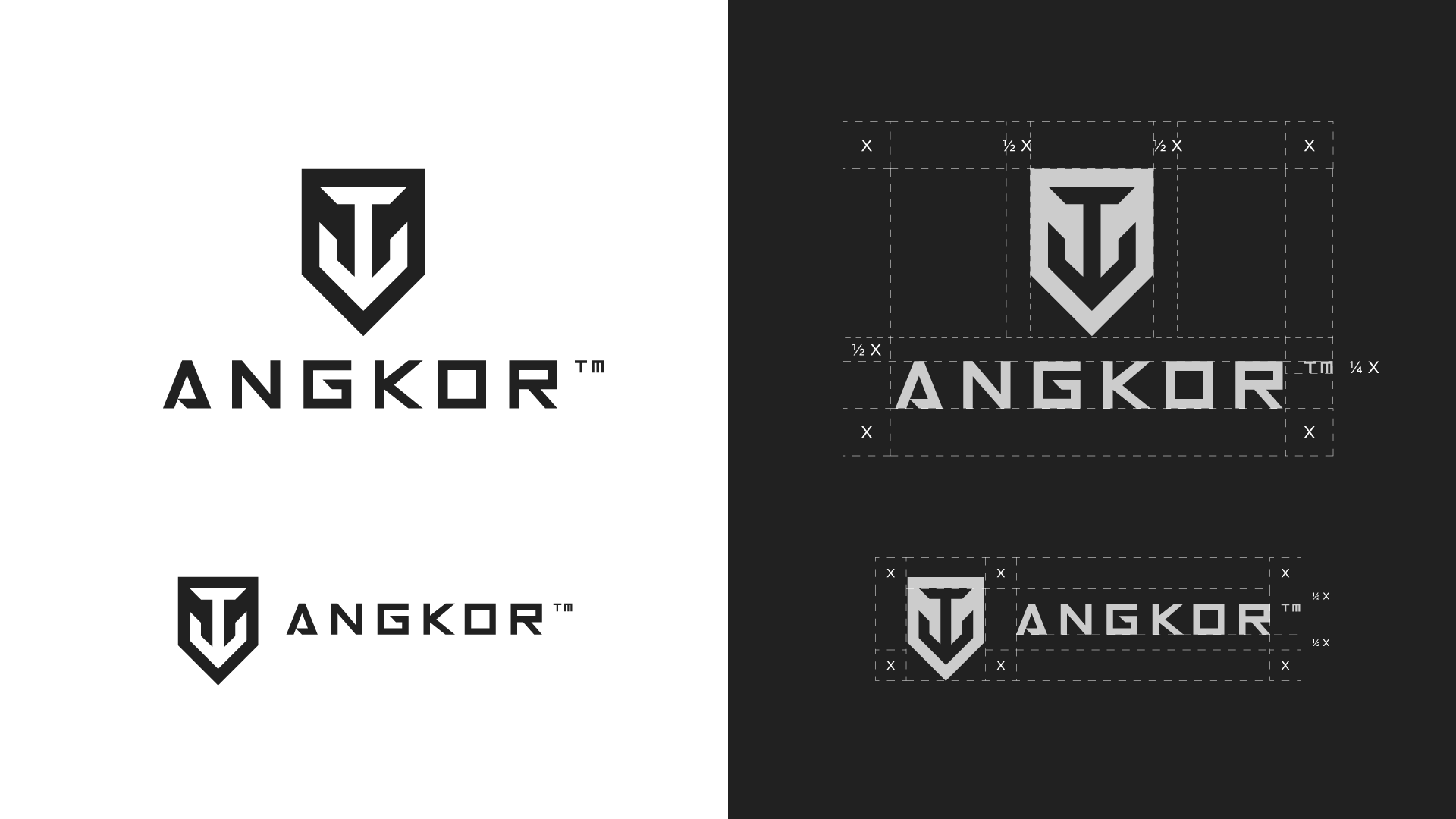
Crafting a visual identity that encapsulated Angkor's core values while extending beyond traditional workout references presented a challenge. The client desired a modern, geometric, and minimalist design. After careful consideration and exploration, a bold design featuring an anchor as the central element alongside the brand name emerged.


The vibrant accent color, red, was inspired by the Cambodian flag, which prominently features Angkor Wat. This choice adds depth and cultural significance to the brand identity.
The project extended beyond the creation of the logo, encompassing additional marketing materials for posters and social media promotion.


Conclusion
The final brand identity for Angkor successfully captures the essence of strength and community while adhering to the client's vision for a modern, minimalist design. The incorporation of cultural elements adds depth and resonance to the brand's identity, establishing a strong foundation for its presence in both physical and digital spaces.
Ready to Start Your Project?
Tell me about your vision, and I’ll get back to you with ideas on how we can make it happen.
