
Coffee with character.
The King Coffee Co. is a specialty coffee brand built around a simple idea: combining the familiarity of traditional coffee culture with a bold, contemporary identity.
The visual direction balances clean typography with subtle retro influences, creating a brand that feels established and recognizable without leaning too heavily into nostalgia.
The Objective
The goal was to create a distinctive identity that could work naturally across the different touchpoints of a modern coffee brand.
Rather than relying on typical coffee imagery, the identity needed a strong graphic character of its own, with enough flexibility to adapt to packaging, signage, merchandise, and digital applications.
The solution
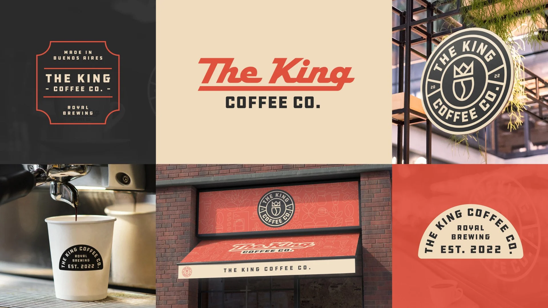
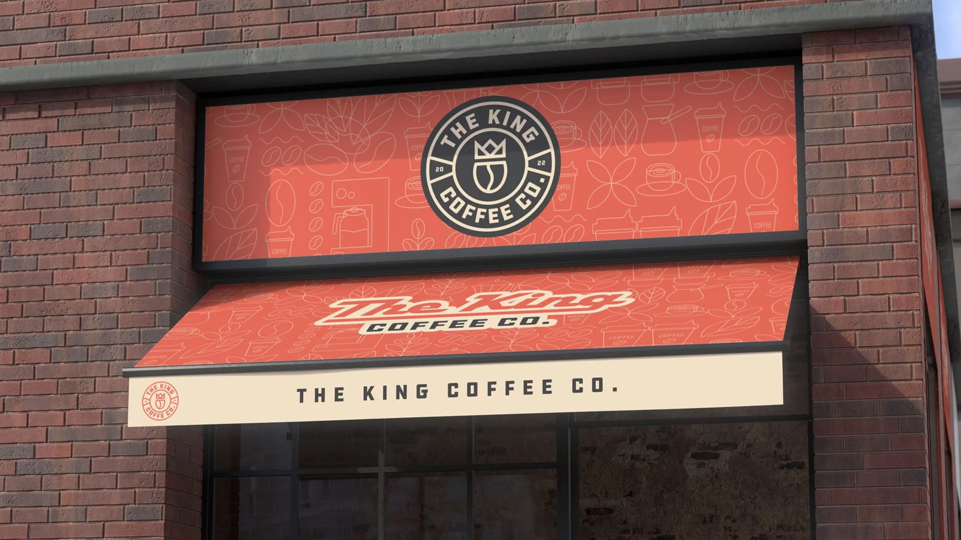
The identity centers on a bold wordmark supported by a simplified crown symbol, creating a direct visual connection with The King name without making the concept overly literal.
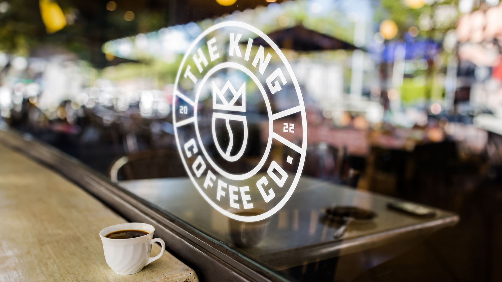
A broader system of secondary marks, badges, and alternative logo configurations gives the brand flexibility across different formats and scales.
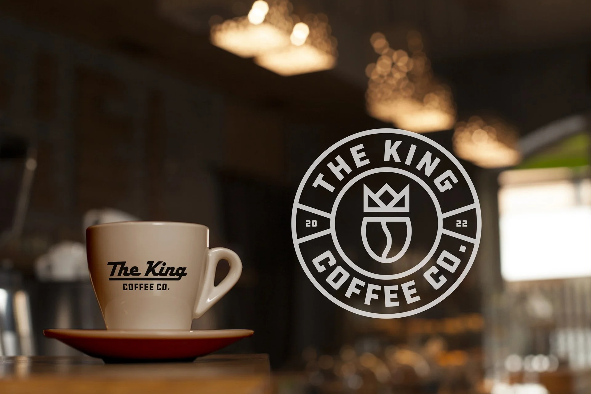
The muted red, cream, and black palette adds warmth and contrast while reinforcing the slightly retro character of the identity. Applied consistently across cups, packaging, apparel, and signage, these elements create a cohesive visual language that remains recognizable beyond the primary logo.

The Result
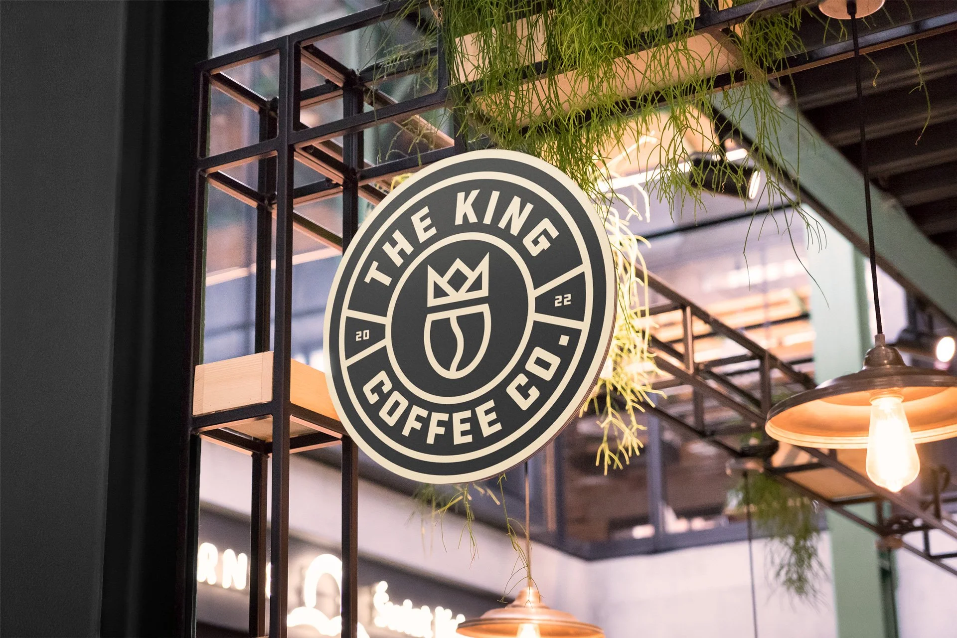
The final identity gives The King Coffee Co. a distinctive and adaptable visual system with enough personality to stand out while remaining practical for everyday use.
From the primary wordmark to the supporting badges and applications, each element is designed to work together as part of one consistent brand.
READY TO BUILD A STRONGER BRAND?
Seen something that feels close to what your business needs? Tell me about your project and I’ll show you how we can shape it into a clear, distinctive identity.